
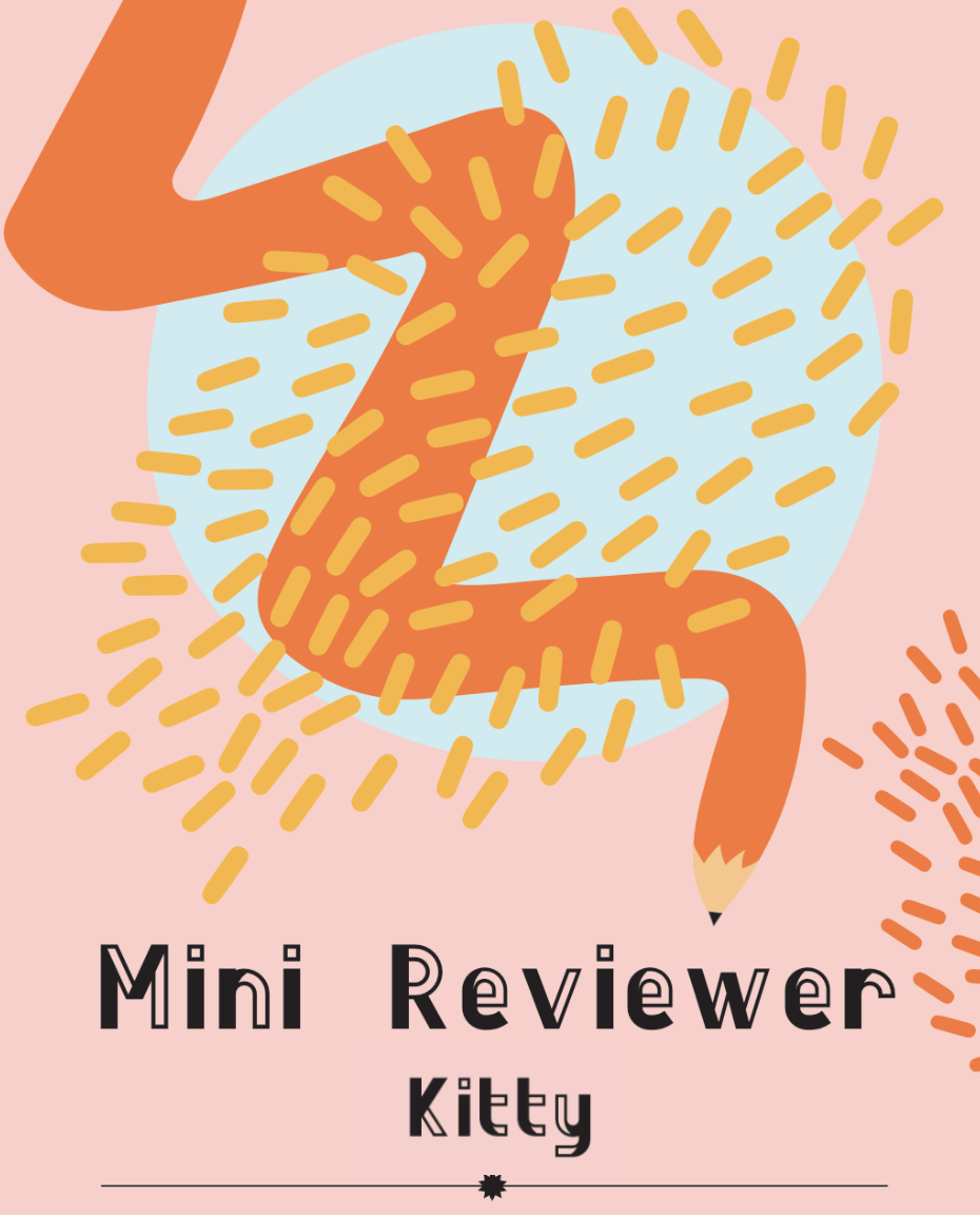
Mini Reviewer
Meet Kitty - our ‘Mini Reviewer’ for Look Again. We will hear what Kitty thinks of exhibitions on display at the Look Again Project Space and events taking place across other venues.
We met Kitty in 2019 and we were struck by her love for visual art and the way she was able to read the work on display and ask some really considered questions. What was even more special about Kitty was her age and her love for art shone through, so we wanted to bring her back to review our exhibitions and events from a young persons perspective.

British Art Show 9 (BAS9)
Aberdeen Art Gallery
Review by Kitty, aged 11
• British Art Show 9 continues at Aberdeen Art Gallery and Aberdeen Central Library until Sunday 10 October. Admission free. For more information about all of the artists exhibiting in Aberdeen and to explore online works please go to www.britishartshow9.co.uk
The fact that British Art Show 9 (BAS9) is being shown in Aberdeen is fantastic, considering it only happens every 5 years and is only being shown in four cities across the UK. I am very proud to be from Aberdeen and feel so privileged and honoured to have been asked to review this show. The exhibition displays art produced between 2015 and 2020 and highlights a period of great change within the UK during this time. Each of the four exhibitions has been adapted for its host city. Alongside the exhibition itself, workshops, performances, and events are being run, giving our communities the opportunity to come together. The show focuses on the themes of healing, care, and reparative history. In Aberdeen, healing and finding ways of living together are explored.
⚠️ Disclaimer - Sadly I could not include everything I saw, as this review would be the size of a novel! Thank you for your understanding.
Aberdeen Art Gallery. A beautiful building lit by the sun, its granite sparkling. I was visiting with Sally Reaper from Look Again (it was Sally who first encouraged me to write about my passion for visual art). I stepped into the magnificent space. As Sally checked in, I looked around. Although I had been in the gallery many times, it was still just as stunning as the first time I had walked through the doors.
We made our way to Gallery 2, where there were pieces from previous British Art Shows which are now in the Aberdeen Archives, Gallery & Museums collection. My favourite was from BAS4 in 1995 and was called “I Love You Still”. A large Y shaped stick was mounted on the wall, and it was covered in HUMAN HAIR. We examined this piece for a very long time because it fascinated both of us. There was no visible connection point between the hairs and the wood! I thought that I would love to speak with the artist (Jordan Baseman) and ask him how he made it.
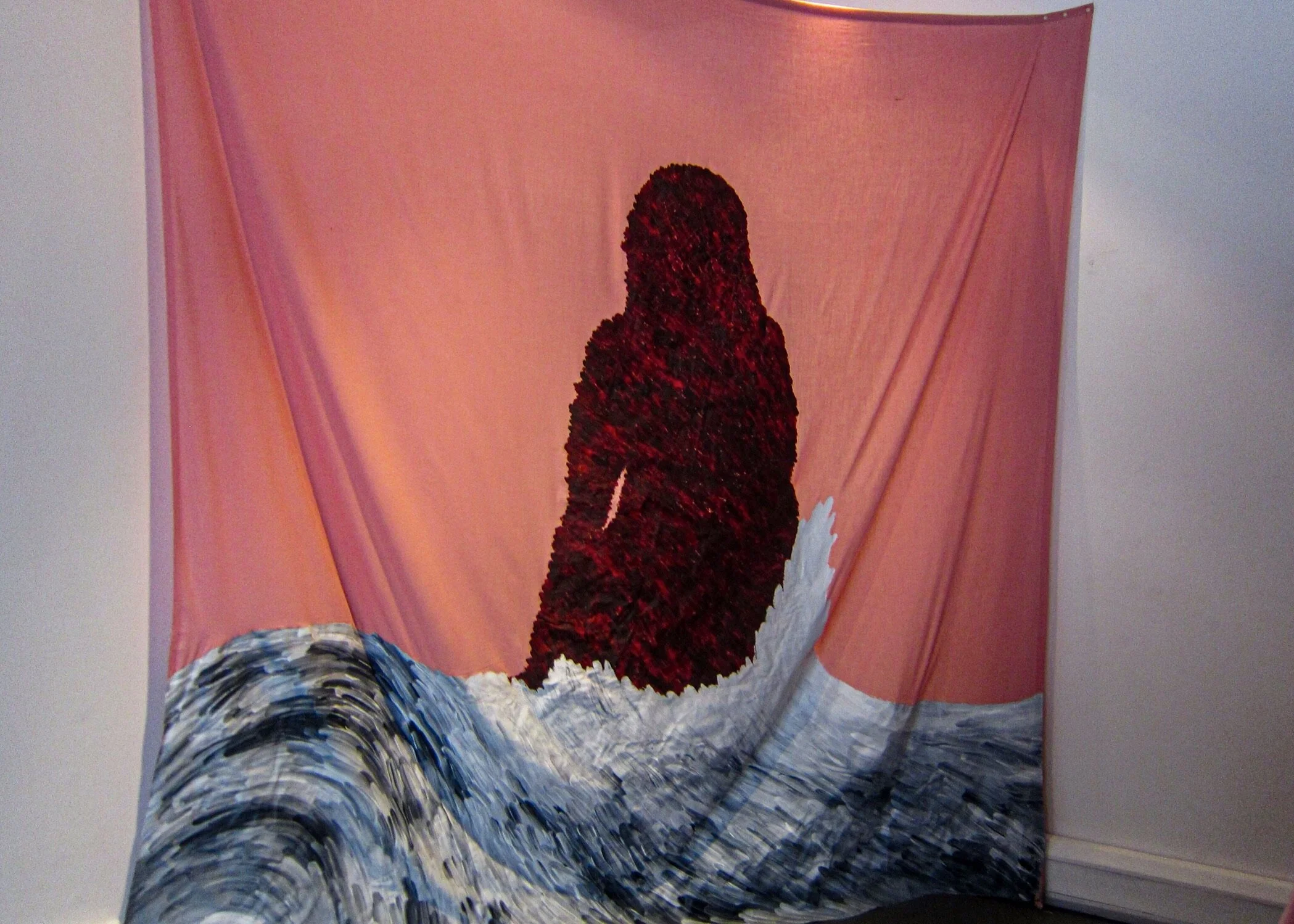
Moving back to 2021, and British Art Show 9, starting with Tai Shani’s work, the atmosphere changed dramatically. The room was dark. The pieces huge and theatrical. It felt other worldly and magical. My eyes were immediately drawn to a large hand curling out of a box. Then a ghost-like object hanging from the ceiling by an orange cord wrapped around its head, the fabric below hanging eerily. The sheer size of the art was incredible, and I couldn’t begin to imagine how the pieces had been made. I loved the detail I could see on everything and the obvious thought that had gone into them. Other smaller pieces sat in the room; they were also stunning. An orb bathed in pink light. Inside, a face made of metal rested in blue sand, leaves curled around the glass, a ladybird balanced delicately on them. Two large and almost pear-shaped objects were suspended above my head. Strange and alien-like, shapes on them resembled an eye and mouth. What looked like a rose vine or barbed wire connected the spheres? Then a candle almost as tall as me, its flame glowing orange, the ‘wax’ was red and curved like some type of organ. I loved every piece here because they were all so beautiful and striking, each telling its own amazing story.
We left this exhibition and moved onto the next gallery. It was relatively empty except for a glass case and a video projected onto a wall. Inside the case there was a colour fan comprised of reds, corals, and peaches. This was part of Cooking Sections CLIMAVORE project, looking at how eat as humans changes the climate. It reminded me of book I was given when I was younger with flaps and turns. One particular page had a wheel that you could turn to make the red in the picture darker. I connected with these colours, not just because of my book, but because they were warm, comforting, and safe. The video by Grace Ndiritu showed different styles of living. Sally and I discussed that the video made us feel seasick because it was filmed in a very jerky fashion. After reading the information about the piece, I thought about the comparison between different people’s lives, and it occurred to me how often we take our incredible resources for granted. Resources such as clean water, healthy food, and the internet. Many people do not have access to these things; however, we do not think about them when we turn on a tap, tuck into a lovely meal, or settle down to watch a movie. Again, art had left me wondering about something that I had never really considered before.
We moved to the next room where the floor was completely empty, but the walls were plastered with paper and tape (Kathrin Böhm). This was a room of art that could be interpreted in so many different ways. Two people could stand together in this room, one of them could love it and find it inspirational and the other might not understand or appreciate it at all. I thought that it was an interesting and eye-catching way of displaying thoughts and feelings, and for me this is what art is all about. I felt it displayed personality and emotion and I connected with many parts of the piece as they related to my thoughts, feelings, and everyday life.
The next exhibition by Uriel Orlow had brightly painted walls of green, blue, and yellow and the first thing I saw were three plates mounted on the wall. One showed an arm pouring grains into a pot, the next featured liquid being poured into a bottle from a pan with a clock underneath, the last displayed a person drinking from a glass. This appeared to be the cycle of some type of drink, like a picture recipe. After thinking about this for a while, my eyes travelled to a television set on an easel next to me, with another next to that. Although there was nothing playing at the time, I found the sets being displayed like this quite ingenious. A wall close by showed a beautiful picture of a shed type building with a painting on its wall which was in the same style as the plates and was of a woman sitting at what looked like a stove in a field. There were three people stood around her, drinking from cups. I felt this displayed a story and wanted to know the finer details. It would definitely be worth a trip to the gallery again to find these out.
We climbed the staircase to the next floor having decided to look in Gallery 17, before a dance performance by Sofia Kondylia began. Entering the gallery, I saw one of my favourite pieces by Joanna Piotrowska, which was a photograph consisting of a mirror held in a woman’s hands, reflecting her face. I loved this shot because I love reflections, but also because it had mysterious look about it. Almost poetic it was beautiful and very moving. Next to this there was a photograph of a woman in a baby’s crib, with her legs sticking out at the end. Sally and I discussed this piece. I thought it was quirky and amusing - as though a group of friends had been taking pictures of each other in different poses. The feeling Sally got from it was very different however and she said that it made her question whether the person was in this pose voluntarily, or if they were imprisoned somehow? Was there a darker story behind the apparent light-heartedness I felt looking at the photograph? She thought that it might make the viewer think about other people who could be in this situation and what this meant. This is a perfect example of how art can make people feel and think differently. We then spent time examining a sketch by Marguerite Humeau, a piece so intricate and intriguing that I could not take my eyes off it because there was so much to see and absorb. It was composed of lines, shapes, and words in black, stretching over a huge piece of paper. It was beautiful in its own confusing way. I felt that it looked like more than a sketch of something - as in a noun or being - but of the void between space and time, along with an entire galaxy of meaning.
Next, we moved over to where Sofia Kondylia was performing Asleep (a pop-up performance, part of the programme of activity orangised in Aberdeen to complement BAS9). I made myself comfortable on the Art Gallery floor, camera poised in my hand. She began. Her movements were slow and beautiful, constantly connected with a bright yellow beanbag. The music was calming, relaxing and almost tribal. The shapes she made were stunning, her eyes forever closed. She told stories with her movements and actions, and I watched her, transfixed. After a few minutes of enjoying this performance, I stood up to leave. Later Sally and I discussed how the plain black and simple attire Sofia had chosen to wear, contrasted with the bright yellow beanbag she danced with, and how this had added to her performance.
Moving through another gallery, we arrived in a dimly lit room where a video played by Patrick Goddard. It was of a woman and a dog visiting a zoo and they were talking. Throughout the room, animal heads littered the floor, silver in the half light. I told Sally that for some inexplicable reason, this video annoyed me. I didn’t know why it made me feel this way because I didn’t particularly dislike it, it just did. In the video the woman and dog visited different animals and the dog mocked their lack of speech and knowledge, making the woman steadily more frustrated until she finally cracked. One of the things that interested me most about this video were the questions the woman asked the dog. Questions like “Does a straw have one hole or two?” and “Is a hotdog a sandwich or not?”. Both questions have two answers, both could be argued. What would your answer to these questions be?
In the next gallery I found another favourite piece artwork by Hanna Tuulikki, where a collection of bird drawings took pride of place. The simplicity of each drawing was eye catching and beautiful. All had been done in a grey scale - which added even more depth – and they were mounted on the wall in such a way that it created interesting levels, curves, and arcs like the flight of birds. These pieces were all so detailed and intricate that I couldn’t look away until my ears picked up a strange sound... Finally breaking my gaze, I saw a dome hanging from the ceiling. I stood underneath it and sound rained down on me, soothing and relaxing. It washed over me like water, tranquil. After reading about it I discovered that the noises were made by an a cappella group mimicking birdsong.
We moved to another room which had a video playing on a large screen. This work was by Joey Holder. The walls in here were painted in dark reds and blacks and the video showed the lifecycle of eels. Mostly it showed them thrashing around, squashed together. I didn’t like this exhibition as it made me feel uncomfortable and nauseous. I know however that it was one of my friend’s favourite pieces - another great example of how art can be interpreted differently.
Having been interviewed by Bart for social media, we continued downstairs where we met Scott Begbie, who was going to interview me for a piece in the Press and Journal and Evening Express newspapers. He was prepared for my interview, but I wasn’t, and I was very nervous. I relaxed quickly however as we had a nice, casual chat about the show, the art, me and Look Again. We made our way to the James McBey library where after some discussion we decided to head to the balcony to film my interview. After the horn honking, seagull squawking, windy weather and speech stumbling had stopped, we had our video.
Moving on, we arrived at our final gallery. The Craziest One. We entered a darkened room lit by bright yellow toadstools or mushrooms about the size of a fist. I had noticed these plugged into to every available and visible socket as we had walked around the Art Gallery. They were called Shrooms and were created by Ghislaine Leung. These glowing fungi were made to invoke a playful feeling and one of childhood comfort but also maybe even something dark?
Next, we were greeted with large hanging tapestries by Paul Maheke, each one emblazoned with an abstract face. My eyes travelled up towards yellow, spun glass shades, their light casting beautiful yellow beams across the space.
Walking through here my eyes were drawn to two jumpers suspended high above the ground. Both were embellished with abstract art and words. Although they still looked like garments that could be worn, they looked like pieces of art also. I learned that the artist’s Mum had made these for him and then he (Hardeep Pandhal) had created works of art from them. They made me feel warm and happy because of course being jumpers, that’s what they were designed to do, but also because the artist and his Mum had worked on them together and thinking about this collaboration was heart-warming.
Around the corner there was a dark room which was empty apart from a single bench. It wasn’t a particularly small space, but the darkness made it feel tiny and claustrophobic. The room was filled with eerie and gruesome noises which made me feel uneasy. I didn’t really want to stay there however once I finally sat down, I found the sounds to be strangely soothing. They still sounded gruesome; they just weren’t making me feel uncomfortable anymore. In fact, rather the opposite. The name of the piece was Deathscape by Hrair Sarkissian, which I thought was appropriate as it sounded almost like the dead were escaping their graves. I would love to say more but I feel it is better for this sound work to be experienced in person.
In an enclosed area, three videos by Zach Blas played against one wall with seating opposite. This installation was strange, and I had no idea what I was seeing at first. A robotic female face was shown, and it was talking. Both the face and voice were distorted. In the background different scenes played out and after reading about the artist’s inspiration for the piece, this made much more sense to me – it was a chatbot that had been corrupted by internet trolls. The piece left me thinking about why people would abuse such a useful resource and who they were. I felt shocked that an individual or organisation would want to turn something so innocent into something evil. It made me question whether everything was really as it appeared on the surface - was the chatbot really as innocent as I presumed? Were these people abusing something, or did they think they were making it right? What was their motive?
Next, I found a space where two old style television sets were stacked one on top of the other (Margaret Salmon). They displayed pictures of flowers and hand gestures, as well as people looking at things like photos and letters. It made me feel as though the televisions were sending pictures or messages to each other, as if they were friends or partners. I found it beautiful and inspirational – as though they were having a silent conversation that I had somehow heard. It reminded me of families and friends keeping in touch with each other during lockdown and “seeing” one another on screens instead of face to face.
Leaving this exhibition, we waited for the artist Florence Peake’s performance to start on the ground floor. The creator of Crude Carewalked on beneath us; pieces of red pottery surrounded her as she lay down on the chequered floor. As she placed the pieces on and around herself, she spoke words that I could not hear as they were muffled through her mask. Grrrr Covid! I could still enjoy the experience of it however and it was moving, thoughtful and almost dark in mood. After Florence had finished, I had the opportunity to speak with her, which was very exciting. I asked why she chose red as the colour for her design, and she told me that it seemed quite bodily, which was part of what she was trying to display. I enjoyed my brief conversation with her as it gave me an insight into her artwork and the inspiration behind it. As we walked through the Sculpture Court, I examined this more closely and realised that it was made up of large red pieces of pottery that looked like bricks on fire, or melting steaks. It was created with the help of carers around Aberdeen, moulded around their limbs and other body parts and it gave the impression of something frozen in motion, or forever paused.
My visit was over, and it had certainly been a truly exciting and inspirational day!
I would like to thank Sally for supporting and believing in me, and to the gallery team thank you for making me feel so welcome. I would like to thank Scott and his cameraman from the P&J, for putting me at ease and being so much fun.
Thanks to everyone who reads this, and for getting this far!
Finally, I would like to thank my parents for supporting me and encouraging me to do the best I can. I hope I won’t be charged for the editing or bag carrying! Thank you.
Come and visit BAS9, it is a truly phenomenal experience and one I hope will inspire you, as it has inspired me.
We exited through the gift shop (as always!) and stepped out into the glorious sunshine.
The day’s task was complete, all that was left now was to write my review.
Check ✅
By Kitty Donovan


Photographs courtesy of Kitty
haan design pop-up 2020
Aberdeen Art Gallery
Review by Kitty, aged 10
‘Exit Through the Gift Shop’
I walked down Belmont Street to the familiar bronze coloured building. From the moment I stepped inside I immediately felt joyful and alive. The chequered floor, pillars, archways, glass and statues made me feel wonderful. It was amazing to be in the Art Gallery again after a such a long time away. I was thrilled when I first heard it was reopening after Lock Down and couldn’t wait to be back. And now I was. The chatter of people strolling along observing the art, was happy and excited. I could tell that everyone else there was delighted to be back in the Art Gallery too.
It was SO exciting to be asked to review HAAN Design Pop-Up. I had been looking forward to seeing Sally and all the Team at Look Again and after chatting and taking pictures, I sat down to speak with Kevin.
Exhibitor 1
Name: Kevin Andrew Morris
Business Name: Kevin Andrew Morris Ceramics
Product: Cast Ceramics
@kevinandrewmorris
I asked about Kevin’s local inspiration and he said that a lot of it was based on his Grandad, who was a fisherman and on fishing and drinking culture. He uses a kiln to make his ceramics at 1000℃ which gives his pieces their colour. He had a rather interesting ceramic on display. It was of a fish. I really liked the fish and the detail in it was so cool. The granite glazing gave it a speckled, dotted effect. Sally, Kevin and I joked that if ceramics went out of fashion he could definitely make chocolate the way he makes his ceramics. I thought that his pieces were really unique and the story behind his work was awesome. He had a ceramic sponge on display and he said that he uses the burnout technique where with soft materials, you can leave them in their mould with the ceramic to burnout in the kiln and this creates a replica.
Exhibitor 2
Name: Mimi Hammill
Business Name: Mimi Hammill Surface Pattern Design
Product: Designs and Patterns on leggings and silk scarves
www.mimihammill.com
As I spoke with Mimi, she mentioned that her favourite patterns were the sharp geometric ones. She also told me about the process of making her patterns. First, she draws everything out in black and white, then adds colour digitally. The reason she adds colour last is because when you make a pattern with your favourite colours, you love it, even if it’s not perfect yet. She uses almost every colour in the rainbow - which really made her scarves and patterns look fun and colourful - but she told me that she almost never uses purple, because when she tries, she can never come up with something she loves and when she changes the colour, she likes it much more. “I have lots of patterns that start off life inspired by buildings,” she said. I thought that this was such an amazing and cool idea - using local surroundings. She also said that she uses landmarks as inspiration. I asked if she had a favourite landscape or landmark. “I have a lot of scarves that celebrate Duthie Park and Bon Accord Baths,” she replied. I absolutely loved Mimi’s scarves and leggings. They were beautiful and exciting. Her colours worked together perfectly on all of her designs. When I lined up to take each shot, the array of colours reminded me of a rainbow. When I am a little bit taller, I will definitely buy some of her leggings!
Exhibitor 3
Name: Megan Falconer
Business Name: Megan Falconer
Product: Silverware and Jewellery
www.meganfalconer.com
Sally introduced me to Megan Falconer’s partner as Megan was not there and we started speaking about her products. Megan is a silversmith and jeweller who makes things inspired by the Scottish landscape and the way it changes – like the tide. She even uses the landscape in creating her pieces. She first makes the jewellery or silverware and then uses her hammers to add extra interest and texture. She made these hammers herself out of rocks and when she hits the silver it dents the metal. Using the landscape to make things, is such an amazing inspiration and had a very pretty affect. I loved it. Megan’s favourite thing to make were her hammers and her bowls. Since the hammers were made of rock, they had a rustic nature-y feel to them. Megan’s partner explained how Megan made the bowls and told me that she uses a raising hammer and wax to give them their shape. She can never anticipate the end result of her pieces because when hammering, she is met with a different result every time. I loved each of her pieces, the bowls were beautiful and the rings were amazing, as was everything else.
Exhibitor 4
Name: Leanh La
Business Name: Leanh La Jewellery
Product: Geometric Inspired Jewellery
@leanh_la_jewellery
While we chatted, I discovered that Leanh got all her geometric shape ideas from architecture and abstract art. She liked building with sharp corners, angles and shapes. She did not have a favourite piece of jewellery that she loved to make, she loved to make all things like broches, necklaces and earrings, among others. When making a piece of jewellery, she first picks her shape from a selection she plays about with on the computer and then picks the colour. Next - TO THE LASER MACHINE! All her jewellery is made with wood and lacquer. She said that she liked to clash colours and that was why her stall was so colourful. Leanh’s jewellery was pretty and colourful. I loved everything.
Exhibitor 5
Name: Anne Marquiss
Business Name: Anne Marquiss Jeweller
Product: Silver and Leather Jewellery
www.annemarquissjeweller.co.uk
Anne told me that she added leather to her silver jewellery to make it softer and to add colour. She blackens almost all the jewellery she makes, so that it doesn’t really look like silver anymore. She also etches patterns into her pieces with acid to give them texture. Her favourite things to make are pendants to be worn around the neck, because these can make outfits look really fab and cool. The thing that Anne liked about her product was that she made jewellery for older ladies, to make them feel really special. She said this was because she thought that at events like HAAN, a lot of the products looked like they were made for younger people. Her Unique Selling Point (USP) was that once she had made a piece of jewellery, she would never make a piece exactly like it again. She told me that she drew everything out in a sketchbook and I quote “A lot of it (the drawing) is to do with this kind of continuous line that I take for a walk, if you understand.” She said that she loved orange but was really open to any colour. All her pieces were amazing in that they were intricate, beautifully detailed and very pretty. She had pictures of her jewellery which she blew up (enlarged) and then folded into origami bags - which was a great idea. I loved her jewellery.
Exhibitor 6
Name: Frieda Strachan
Business Name: Frieda Strachan Fibre Artist & Designer
Product: Fibre Art
www.friedastrachan.com
Frieda makes lots of things - rugs, cushions, woolly jewellery, woven wall hangings and macramé plant holders. “If you can make it with wool, I’ll try my hand at it basically,” she told me. She said that her favourite thing to make were the rugs because she gets to use her tufting gun, which looks like a machine gun but instead of bullets it shoots yarn. When designing her rugs, she goes right in with the sharpie on the canvas - no sketch book required. She doesn’t really plan anything except the rugs, because the edges of these are wavy and she needs to know when to stop the gun. She decides on colour first and the shapes just come. Then she has to number the shapes – like painting by numbers - so that two colours are not beside each other. She asked me if I could spot the mistake on a rug we were looking at. I could and she told me that she was planning on telling people that leaving one error was her thing. Frieda told me that her inspiration had previously been Scotland and places she had visited, but now just does what makes her feel good and has fun. She also used to be inspired by geometric shapes, but now she mainly uses wavy ones. She repurposes lots of different items and uses things that are intended for other purposes - such as rope, copper piping and old woollen cones and incorporates these into her necklaces. She taught herself to weave and everything she uses is homemade, but she liked that about them and so did I. They looked organic and rustic. Her earrings looked a bit like rainbows because of their arch shape with white tufty bits at the bottom, which she had never noticed before. I asked if she wore her stuff to display it, or used the rugs and cushions in her own home. She replied by asking me if I had ever heard of the saying about not wearing the band’s T-shirt when you go to see the band? She said that she was a bit like that about her jewellery, but had one of her rugs in her studio and cushions in her house. She uses wool from Shetland and when she visits there she packs her suitcase full of it. She also uses Islandic wool because she visited there last year and sent two boxes home and she has some wool from Texas which her friend sent her. I loved every one of Frieda’s pieces, they were pretty and looked like a lot of time had been spent on them. The colours worked together and the different wools gave the cushions and earrings life and a sense of fun. I really enjoyed speaking with Frieda and I hope I get to again.
Exhibitor 7
Name: Aubin Stewart
Business Name: Aubin Jewellery
Product: Jewellery
www.aubinjewellery.com
Aubin told me that she makes her jewellery out of mixed materials or alternative materials like perspex, metals, leather and pearls. She said that she loves making broches because they are like little sculptures. When making jewellery she plays with shapes and colours and then puts them together to see what works. If she gets a good feeling about something or a little buzz, she will continue from there and build on the idea. She told me that she tends to make things by experimenting rather than drawing or designing first. “There are no colours I would rule out. There might be a colour that I don’t like one week but then it is my absolute favourite the next week, I think colours totally reflect how you feel and what mood you are in,” she explained. I very much agree with this and having no particular colour pallet means that you are open to everything. I asked about Aubin’s inspiration and she told me that some of it comes from being a mum. She has a little boy and often looks at children’s toys and watches programs “Like Hey Dougie,” she said. She went on to tell me that she is inspired by the simple shapes that are seen in children’s stories and toys and that she also takes inspiration from local buildings and parks. I loved her pearls and metal highlights and a pair of very cute, heart earrings. She told me that quite often she has half-finished projects and will make an item up to a certain point and later decide that she needs to add something else to it, but cannot put her finger on what. Then she might leave it for a while before adding another component, which finishes it off. This means that she can be juggling up to ten pieces at a time. She likes to use pearls, which are seen as precious, with things that are less precious and tries to make them look like they have value, because her understanding of precious is how well something is finished and how it is designed. Sometimes, she said, she wears her jewellery to see how it holds up over time and how it sits on the body. Her pieces were very pretty and brightly coloured and I took great pleasure in taking photos of them. I also loved that she was inspired by being a mum.
Exhibitor 8
Name: Karen Barrett-Ayres
Business Name: Bramble Graphics
Product: Doric Inspired Merchandise
www.bramblegraphics.com
Fit like? Karen is a graphic designer and sells cards, art prints, tea towels and bags. She also sells lots of cool badges and my personal favourite, a grab bag with the Doric word “BUMFF” on it - meaning stuff. All of her pieces are Doric related and she told me that her biggest sellers are her books. I had in fact seen one of her books “Doric For Beginners” in Waterstones on a previous trip into town with my Dad. Her other book “Flora the Foggy Bummer Meets The Foostie-McNasties” was also on display. She said her favourite thing to make was (being a graphic designer) anything graphic with solid, bright colours and things that look good screen printed. “The thing about Doric,” she told me “is that it is always being associated with an older generation, so what I have tried to do is make it quite contemporary.” I loved this and thought that hopefully in years yet to come, children will still know and appreciate Doric. Her local inspiration is of course the dialect but the story behind it is quite cool. Karen told me that she had always had an interest in Doric ever since she was six years old and had moved to Aberdeen from Papa New Guinea. She was in the playground when somebody spoke to her asking “Far di ye bide?”, meaning where do you stay. She couldn’t understand them so went home and said “Mum they speak a different language,” her mum replied “ No, no it’s just the Aberdeen dialect.” I think this is fantastic inspiration for a business. Karen is passionate about Doric because it is unique to the North East and is a part of our culture and heritage that she wants to keep alive. She told me that she takes inspiration from hearing conversations on the bus or on the street and that she has a notebook to jot down ideas. Karen went to University and art school in Dundee and learned about typography there. Throughout her work, this is a theme. All her cards are printed locally, as well as her books. I loved each of her products – they were really cool and the colours popped. Her inspiration was phenomenal and was such a special thing.
Exhibitor 9
Name: Laura Sheriffs
Business Name: fernweh
Product: Bags and Mountaineering Accessories
www.fernwehuk.com
When I came to Laura’s stall I loved everything. The colour scheme, the bags, the setup, everything was awesome. We spoke about her inspiration - which was mountaineering -Scotland, adventure and the outdoors. I love anything and everything about being outside (except spiders) so I thought that this was awesome and the bags had an outdoorsy feel about them. She had loads of different types of bags for sale - tote bags, cross body bags, pouches and ruck sacks, but her favourite were the roll tops. She told me that this was because her favourites tend to be the things she had most recently decided to make. She said that then she gets used to it and tries making something else, which becomes her new favourite. Her colour palette consisted mostly of natural colours and her bags were made from waxed cotton, which I loved the feel of. This also gave the colours a muted appearance. She told me that at markets like HAAN, her little pouches were very popular and she sold lots of them. She said that she also liked to take some of her bigger pieces to put on display at markets and that these were for sale too. She explained that she uses a sewing machine to make her bags, with buckles and rivet clips for the clasps and that as a rock climber herself, she always tests her bags for durability before selling. I loved the labels she used for her products – each had the words “Go further. Stay curious” on it - and I asked how she made them. She told me that she used a laser etcher on leather and that Dundee, sail cloth and fishing were among the things she was inspired by. I loved the bags that she made, they were pretty and practical and they felt like bags I could take on an adventure.
Exhibitor 10
Name: Helen Greensmith
Business Name: Helen Ruth Scarves
Product: Scarves, Head Bands, Notebooks and Art Prints (But Mainly Scarves)
www.helenruth.co.uk
Last - but definitely not least - I chatted to Helen. Scarves are Helen’s favourite thing to make she told me because she can draw everything on a large scale. She starts by drawing out her designs in a sketch book. Sometimes she has a really clear idea of what she wants to do and she’ll start drawing out all the motifs and elements of the pattern and other times she will just say “I think I will do a mermaid scarf,” and let the idea run until it comes together. She said that she doesn’t really use realistic colours - more wild, ‘Out There’ ones. She also thinks about what colours will look good for people to wear though and what people will like up against their face. Also thinking about the design and what it is made up of dictates some of the colours in the scarf. She uses a computer to make the layout. Helen said that she mainly uses silk and wool which are her favourites, but that more recently she has been experimenting with linen and cotton. She gets a lot of inspiration from the landscape, so from the hills, the forests, the sea and the animals that live there. She is also inspired by Scottish Fairy Tales. These are great things to be inspired by. Fairy tales and folklore also inspire very easily as without pictures, you are left to imagine everything. Sometimes Helen will read a story or someone will mention something that will get her thinking. She has a favourite scarf named the Blood Moon Scarf which was inspired by the Picts, who were an ancient race that lived in Scotland. The scarf was decorated with Pictish ladies, animals and a stone circle. Helen gave me a facemask she had made, which I absolutely love and will keep forever. Thank you very much Helen.
Before I left the Art Gallery I visited the gallery shop and I very much enjoyed this.
I spoke with Susy Bell, the Retail Manager who told me that there was something for everyone there and this was absolutely true. On display were toys, cards, stationery, bags, jewellery and much more. Susy told me that there were items for sale in the shop that you could not find on the high street, as well as pieces that celebrate Aberdeen and The Art Gallery itself. Currently they are stocking a range of items which are based on the high rise buildings around the city. Everything there was unique and I adored it all. As they support local businesses, many of the shop’s products were made in and around Aberdeen. Jewellery is their best seller and there were so many beautiful and unusual pieces that I loved, as they were colourful and interesting. I love spending time in the shop whenever I am at the Art Gallery – there is always something new and exciting to spend my pocket money on.
I would like to say thank you to everyone I spoke with, to Sally, The Look Again team, my Mum and Dad (for the proof-reading and bag-carrying) and my trusty notebook.
Happy New Year!
Kitty Donovan
Age 10


Photographs courtesy of Kitty
‘Ferning Foaming Bloom’
Look Again Project Space
Review by Kitty, aged 9
Hello again!
I feel privileged to be asked to write my fourth review for Look Again – the artist Amy Gear’s Ferning Foaming Bloom.
As I walk in, I am immediately sucked in to the atmosphere. I see lots of pinks, reds and oranges - warm, feminine colours. Now I am not saying that you can’t like warm colours as a man, but I have a feeling this exhibition is supposed to be feminine.
In the middle of the project space I see a huge tent set up and I am intrigued.
I meet a lady called Martha - who l haven’t met before. We discuss what I think of the tent “It isn’t like anything I have seen in the Look Again exhibitions before“ I say, looking at the tent ”it’s very different”. When Sally arrives, we speak for a while and then much to my enjoyment we find ourselves discussing the exhibition – from inside the tent. This is really cool because it feels like I’m in a cave on an adventure!
There we sit down and I hear, as I call it, a “sound projection of words”.
The outside of the tent is made from bed sheets and she explains that they came from a place where Amy had once stayed. The design on the inside of the tent is completely different from the outside and is a fern pattern. Black sheets cover the interior of the tent and the fern design is painted on these in white. The fern design isn’t a fern design, but a microscopic image of spit. Weird I know, but it makes sense if you know how it works. Sally tells me that female’s spit gets saltier some days of the month (I think because of hormones) and that the spit when dry, crystallises and forms a fern pattern - hence the name FERNING Foaming Bloom. The "sound projection of words” spoke about this and I think that it helps you understand the thinking behind the exhibition’s meaning. I liked that Amy used her local Shetland dialect.
All the other pieces in the exhibition are painted on the same sheets that the tent is made out of and Amy has used ordinary thumb tacks to hang them up, except that she had spray painted them to blend in with the paintings. Most of the paintings have some part of them that looks like they have been finger painted but they haven’t. Sally explains that the paintings are demonstrating the body becoming the horizon, like stacks in the water. Like the islands in Moana (the Disney movie).
The first painting looks like someone doing a yoga pose under water. The painting is split in half horizontally and the background on the top is darker, with the body lighter. The background on the bottom being lighter and the body darker, makes it seem as if it is under water.
Strangely the next painting looks like someone doing synchronised swimming in mud - or someone doing a handstand behind a hill. Whatever they are doing, l want to know who they are? Where they are? What the brown ground is? All questions that would never be answered, but it really gets my mind working.
Next we come to a painting of what looks like a mermaid sitting on a rock in the waves. Something I really like about all the paintings is that the people are not painted to look like people - just silhouettes of colours. The “mermaid “is red and black, which really stands out on the pink sheet, against the light blue waves. This one looks to me to be finger painted and is one of my favourites.
Another painting looks like someone’s face emerging from a flower. A pink, white and purple flower. This sheet is black, or a very dark purple and the light springtime colours really stand out. This painting takes me a minute to figure out, but once l do, my mind flies with ideas. A flower? A fluffy cushion? A giant, crowd surfing on purple hands? Some are crazier than others!!!
The next painting has a similar effect to the first one - like it is under water. Only this yoga pose is one where you lean back and then bring your feet to your head. The body is done in yellow and looks almost misty against the dark crimson sheet. It seems a bit like a ghost.
Moving on, this painting looks a bit like a volcano erupting from candy floss, exploding out of white water. None of it really seems to make sense and l don’t know what to make of it. It is definitely one of my favourites, but l don’t know why. Maybe it is the colours, or the way it doesn’t make sense. I don’t know.
I am now standing in front of a painting which seems to be of a bright pink lake with what appears to be the Statue of Liberty in the centre. Well I don’t think it is supposed to be the actual Statute of Liberty, but it looks like it. The green once again looks textured - like it has been finger painted, with different shades of green and white. The pink lake makes me wonder if someone has swapped out the water for raspberry coloured ink?
As we move on, the next painting I think at first is a giant thumb print and then Sally points out that it is someone bending over. For a minute I can’t see it, but soon l get it. The person is pink and white and again looks finger painted. To be honest, I really like the “finger painting effect” - it just seems to add something to the paintings.
The final painting again looks like a woman in a yoga pose. She is kneeling down and bending backwards and she is pink and black! The two completely different colours work very well together. I like this painting very much.
I loved reviewing this exhibition. It taught me some things I didn’t know, like how our crystallised spit makes a fern pattern, as well as being interesting and cool to see. Sally told me that Amy’s inspiration for the exhibition was stories that she had been told as a child, of giants and that she had thought all giants were male, before discovering that they could be female too. I had noticed that many of the paintings included water in them – or what appeared to be water, although in different colours – and Sally told me that there was a coastal theme throughout the exhibition inspired by the island where Amy lives – Shetland.
Thank you Mum, Dad, Sally and Martha. I am very excited about reviewing the next exhibition.
Kitty


Photographs courtesy of Kitty
‘an empirically grey area’
Look Again Project Space
Review by Kitty, aged 9
It was so exciting to be asked to do my third review for Look Again and this time at a private viewing. So exiting!! I am only nine years old and to be invited to do this AND meet the artist – Peter Chalmers - I was chuffed! A couple of days beforehand I did some research and watched a video of Peter being interviewed on an exhibition he had done a few years ago - Backwards Forwards (Again). In the video he spoke about many of the different pieces he had done and about how he saw his art. I found the video inspirational and wanted to learn more about Peter and his work.
On our way to the Look Again project space I told my Mum that I felt nervous. She asked why - because I had already done two reviews. I told her that this was the reason – because I had already completed two reviews, people might have high expectations for my next one! I wanted to make sure that I did a good job – especially since there was only one artist’s work on show. I had taken Grey Bunny for luck and Mum said just to be myself and have fun and I’d be fine.
As I walked in to the Exhibition, the atmosphere was electric. There were quite a few people there and everyone was chatting and having a great time. I spotted Sally and went over to say hi. We spoke for a bit and I felt less nervous and a bit more excited – I hadn’t met Peter yet though! Sally asked if I wanted to meet him right then, or later. I really wanted to meet him straight away so she asked him if he would come and say hello.
Sally introduced us and when I shook his hand he said that it was lovely to meet me. Then he said something I wasn’t expecting - that he was a bit nervous because this was a solo exhibition! I told him that I was nervous too because I was reviewing just his work, as well as meeting him – a real live artist! We chatted for a bit and he told me that earlier his mum had said he should change his outfit because he didn’t look smart enough and that made me giggle because mine had said the same. That made Peter laugh and I didn’t feel as nervous anymore. We had found two things in common already! Peter asked me if I wanted to have a look around the space with him and although I did, I was worried that I wouldn’t know what to say to him – but he seemed really nice, so off we went.
Peter is a painter, so all of the pieces in the exhibition were paintings.
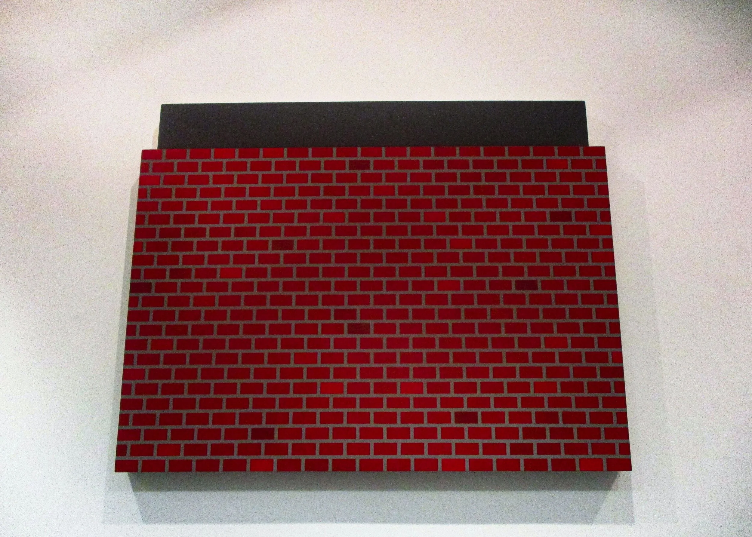
The first one we looked at was of a brick wall. The piece was made of two different parts - the wall and a grey background. The two parts were placed one in front of the other and the wall itself was lower than the grey piece further back. Now you may think that a painting of just a brick wall is kind of odd and it did surprise me, however the painting itself was SO much more than just a brick wall. Looking at it really left me wondering whether there was something else something over the wall...? Sally and I discussed whether there could be something there and what it might be? A secret message? A message you could only read in the reflection of a mirror - like another one of Peter’s paintings? Another painting? I said to Sally “I wonder what Peter wants to tell the world?” The painting kind of mesmerised me. If you stared long enough at it, it seemed like a hypnotism tool. I loved the use of different colours and they really added to the piece.
I really thought that the next piece matched the name of the exhibition - An Empirically Grey Area. In it there was a cloud with a finger coming out of it which was pointing to a grey canvas - a grey area. Something only I had noticed, was that a rainbow was shining over the cloud! A light in the ceiling above was coming out of its socket and had made this rainbow effect on the wall above the cloud. Peter said that he hadn’t even noticed it - because it wasn’t intended! I thought that it was really cool and that I was happy I was the only one who had noticed it. I loved this painting – it was definitely one of my favourites.
The next canvas was completely grey with a gold calf standing on top and I liked the way it looked. “I quite like animals that aren’t the colour they are supposed to be, just all one colour. And I am a huge fan of gold!” I exclaimed. I thought that the calf looked a little rustic and I said this to Peter. He told me that he had achieved this with lots of coats of paint which had been rubbed with sand paper to get the desired effect. I noticed something that Peter had done with all of the paintings - instead of the sides of the canvases being grey, they were white - which I think really added to the pieces.
Another painting we looked at was of a grey fence on a grey background and I have to say I quite liked the grey on grey. The fence was not a painting but two different pieces, so that you could see right through it to the grey canvas behind. This made the painting seem 3D and it really stood out because of this. I liked the effect.
I thought the next painting was really cool – it was of a hand holding up what seemed to be a piece of paper. The paper or canvas had a face on it of a man - but was he sleeping or awake? You couldn’t tell because if you covered one eye he looked like he was sleeping and if you covered the other he was awake! I thought it was awesome.
A few people were gathered around a piece that was a mirror with a red frame that had grey wavy lines on it. I loved this piece because it was cool to see myself in a piece of art. That’s not something you usually get the chance to see in a gallery and it made me feel like I was included in the exhibition and part of it.
A grey canvas that had a horse at one end of it really drew my attention. The horse was raven black with a gloss mane and tail. Peter told me that he had to re-do the horse SIX times because of that gloss. This piece I liked. I thought it was really funky with the glossy black, black and grey I loved the way it looked with the horse at one end and not in the middle of the canvas.
Next we looked at a glass frame that had what looked like big paint chips in different shades of grey and black. Peter mentioned that the frame was like the window in his studio. He asked me a question - was I looking from the inside out or the outside in?
This was a tricky question and we talked about it being the same sort of question as whether a glass is half full or half empty. There is no real answer to this question as it is all a matter of perspective and everyone’s is different. I liked that this painting me think about it in this way though. It was intriguing.
The last piece I looked at was a painting that was all grey with gold details. The gold was not painted flat onto the canvas, but a separate piece placed on top of the grey. I loved the way this was put together - it was one of my favourites. I wanted to take it home and put it in my room, but it was a little too big so I didn’t bother to check whether I could borrow it or not.
When I was asked recently whether I was a kind art critic or a harsh art critic, I replied that when I look at art, I see the things I like and not the things I don’t like. I think that probably makes me a kind art critic but it was easy to be kind at this exhibition because it was fantastic! I met so many lovely people who made me feel incredibly welcome and as I said to my Mum and Dad when we left “That was one of the best nights of my life!”
In one way it was scary to look at art from just one person because what would I have said if I hadn’t liked anything? In another it was great, because I could get a feel for that one person’s work and whether it appealed to me or not quite quickly (it did!).
Thank you Sally and all the staff at Look Again for inviting me to do this and to my amazing Parents for letting me stay up so late on a Friday night!
Thank you Peter for spending so much time taking me around your exhibition. I loved it! You really inspired me and I look forward to seeing you again in the future.
Kitty


Photographs courtesy of Kitty
‘Embedding’
Look Again Project Space
Review by Kitty, aged 9
I had arranged a date to view the Embedding Exhibition.
Camera? Check! Notepad and pen? Check! Parent? Check! Alright, let’s go! And once again I set off for St Andrew Street - and this time, I was a little less nervous than I had been before.
Sally explained to me that the exhibition was about offshore and that it was called Embedding. Things that were different were that this exhibition was only over one floor and had more photographs than the other one I reviewed. As soon as I walked in, a few things caught my attention.
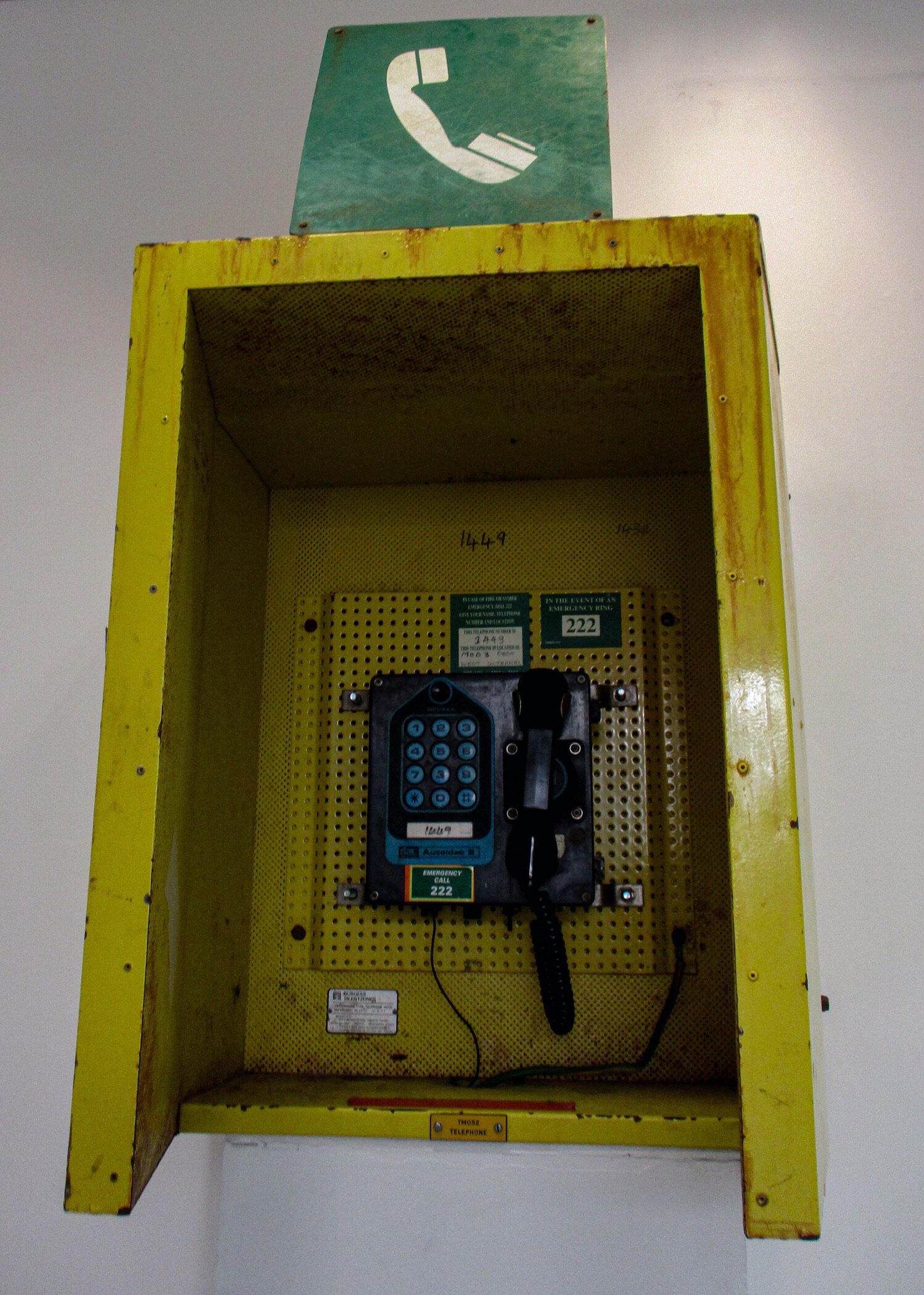
The first was a phone box and I couldn’t figure out why it was there, but when Sally explained, it made sense. It was the phone box from an oil rig and the person who had made this piece of art had recorded interviews she had taken while on the rig and transferred them into the phone so that when you picked up the receiver you could hear these interviews. Sally said that it was a sound art piece.
Another thing I liked, were two paintings of oil rigs and as I soon discovered, they were by a lady who had never been on an oil rig before, but had gone out to one to see what it was like so that she could paint it. The paintings were very textured and looked really cool from the side.
There was a wall of photographs lined up and to me they said “Everyday life on an oil rig’. There were black and white ones and coloured ones too, taken of lots of different parts of the rig from so many unusual angles that I had never seen used before. I loved them all, but my favourite was the portrait of a worker. It was awesome!
One piece that really grabbed me was a light box. It seemed to be a sort of plan for an oil rig. Sally said that the lady who had made it had used banister rails for the stand that held it up, I thought that was very creative and a good use of materials. The plan was made of many different layers of perspex that had different parts of the structure etched onto them and then lined up in front of each other to make the finished piece.
A collage of different postcards covered part of a wall. The artist had printed these onto paper to create the collage and the popping colours really made me smile. There were four different types of postcard and they all worked so well together. I saw that some said “Greetings From Brae Bravo - the City in the Sea”. Sally explained that these postcards had gone to the oil rig and sold out, because everyone was sending them home to their friends and families.
There were several drawings on one of the walls and the person that had drawn these had really played with scale. The artist had gone to a yard that had pieces of an oil rig on display in it. What I mean by “played with scale” is that usually when you draw or paint something, you make it smaller than it actually is. What she had done was taken a piece about the size of a child’s fist and made it bigger than it actually was. So, if you held up the actual piece from the rig against the drawing, the drawing would be bigger. I thought this was so cool. She had drawn other things too, like pipes from the rig, clamps and the links from a chain on a crate. I thought they were all fantastic. The artist had used oil bars as a medium - which I thought was funny, because when Sally told me this, we were standing beside a drawing of pipes from an oil rig!
The last painting, I saw had been done by a person who had actually worked offshore, so she did her painting mostly from memory. This was a sort of collage and had what looked like part of the rig in it with little images of people and over the top was a net pattern. I loved it.
Reviewing this exhibition was so much fun and once again I have a few ideas for my room! The art on display made me want to learn more about life offshore and the structures themselves. It seemed like you could do lots of normal everyday things on an oil rig that you would usually do at home and I hadn’t expected that.
I am so excited to do the next one!
Artists:
Phone - Sophie Stewart
Scale drawings - Smiljana Curic
Postcards - Grace Ireland
Collage painting - Gail McMillan
Textured painting - Charlotte Miller
Plan - Iris Walker Reid
Photos - Sean Steen, Lauren Smith, Heather Allen, Lewis Gault
Kitty


Photographs courtesy of Kitty
‘Staff Outing’
Look Again Project Space
Review by Kitty, aged 9
When I found out I had been asked to be Mini Reviewer for the Look Again, Staff Outing Exhibition, I felt honoured and a little apprehensive - What would I need to do? What would I write? How would I feel?
On the day, I took my camera, notepad and pen and off we went to St Andrew Street. On the way I was really hoping something in the exhibition would jump out at me and grab my attention.
When I got there and met Sally and Claire, I felt welcomed by their kindness and they were enthusiastic about the exhibition, so I was excited and couldn’t wait to start looking around. The exhibition was over two floors. The main part was on the ground floor where you walk in and then downstairs in the basement was a darkened area with projections and light art. The top and bottom floor were painted white - which I thought really made the art pop.
When I was looking at the art, a certain piece caught my eye. This was a clock tower. A piece made with all working clocks stacked on top of each other, with a silver pocket watch to top. I thought it was awesome.
Another piece I liked, was a painting of a horse or donkey with human feet. It was abstract and unique. I loved it.
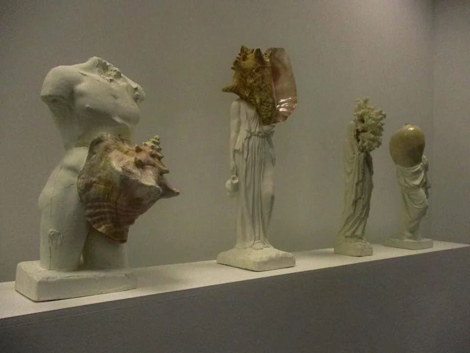
The “Sea Chicks” as I call them, were pretty cool. Eight paintings of female human bodies with sea creatures and plant features for limbs. Next to them were miniature plaster statues with shells and coral incorporated into them where the head and other body parts would usually go.
When I went downstairs, the darkness of the room and the brightness of the projections and light boxes made me buzz inside. One of the pieces of art was a projection of a flock of birds. It was dramatic. There were sheets hanging from the ceiling and the projection was hitting them and going through to a wall behind. The way the projection was split by the different sheets was very striking and I was in awe.
The water bowl projection blew my mind. The way the bowl was set up in front of the screen was just awesome and when the projection played, it looked as if everything that was happening on the film was actually happening in the room.
The light boxes looked extraordinary in the dim room. One that I thought looked a bit like a train really caught my attention. I was intrigued by it.
There was a drawing and I couldn’t really make head or tail of it. What was it? A radish? A bone? I asked Sally and she thought it looked like roots and I quote her “It can be interpreted in many ways”. I think this is true for a lot of art.
The most fun exhibit I thought, was a short hallway with pompoms hanging from the ceiling at different heights and with fairy lights at the end. I used this as an obstacle course (I’m not sure if I was supposed to!) and it inspired me to want to try something like this in my room.
I loved reviewing this exhibition – it was so much fun and I’m so glad that I was asked to do this.
Thank you Sally and Claire.
Kitty // Age 9


Photographs courtesy of Kitty